Help Us Choose an Authors Photo: Vote for Your Favorite?
Posted 14 years ago by C.C. Chapman | 25 CommentsYou may not know that I’m a bit of a photography junky. It is pretty much a guarantee that anytime you see me, I have a camera of some sort on me and I’m constantly taking pictures of the world around me. My favorite are faces and people in general. If curious you can view my photos on Flickr.
So when Ann and I wanted some photographs of the two of us together I wanted to be sure to choose a photograph that I knew would be able to capture our unique personalities and I knew that my talented friend Derek Wilmot would be perfect for the assignment. He is known around New England as a top notch event and portrait photographer and I’ve been lucky enough to get to know him over the past few years and love his work.
These pictures were taken to use in promotions for our book tour, in newspaper and magazine articles and by you to help spread the word about the book. If you do use them in any way, you must be sure to credit Derek and link to his site at http://www.derekwilmot.com.
As we talk about at length in the book, giving proper credit for any content you use is not only the legally right thing to do, but it is a common courtesy that you should never forget. Thanks for the great photography work as always Derek!
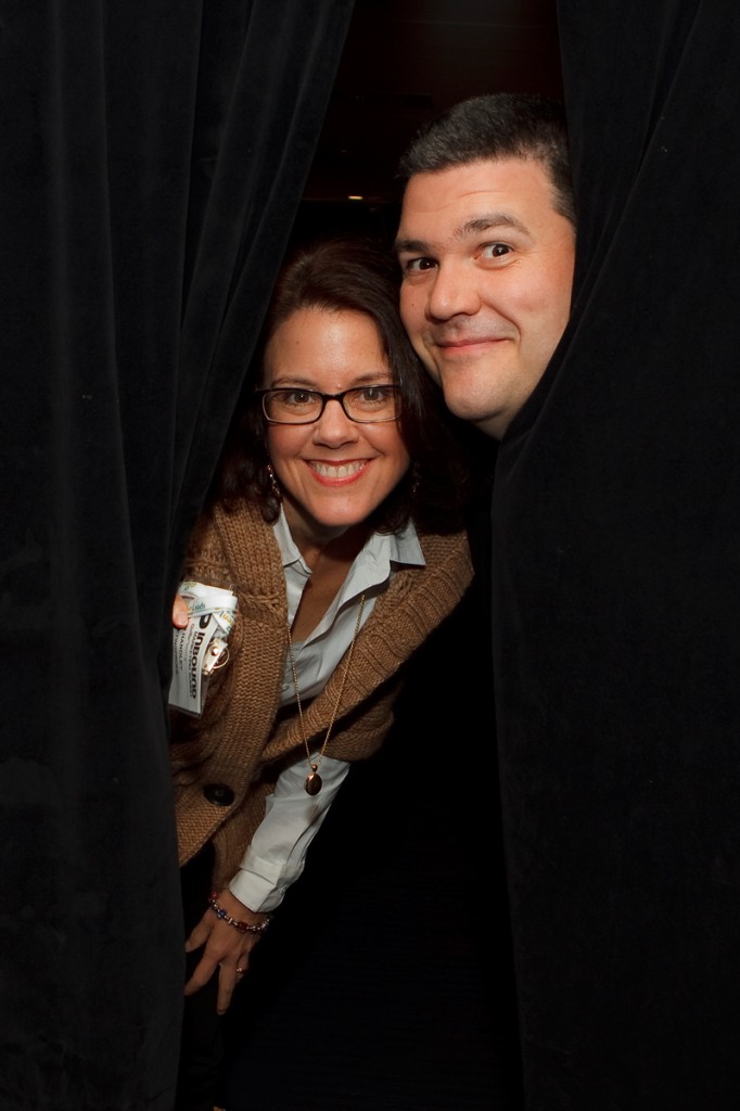
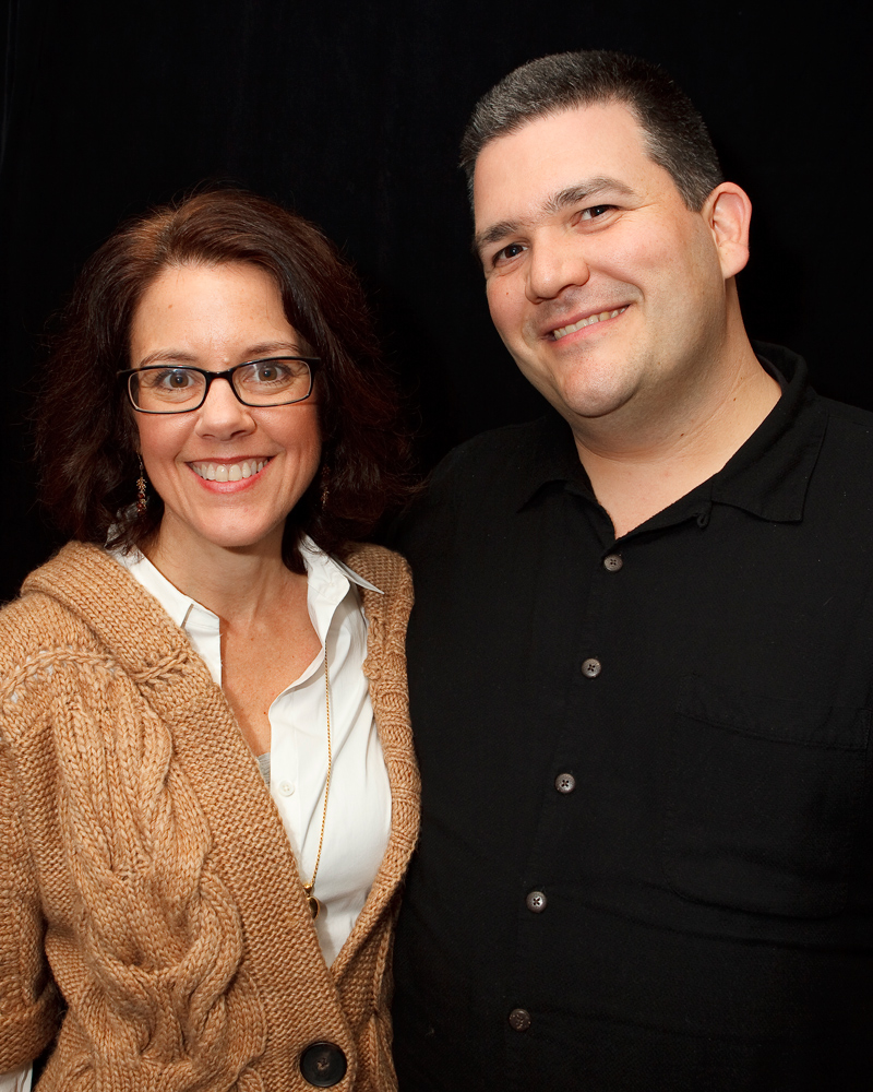
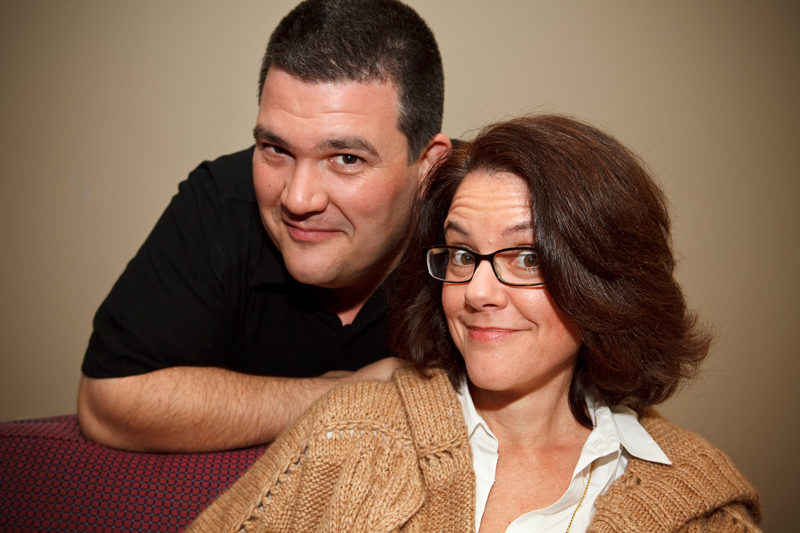
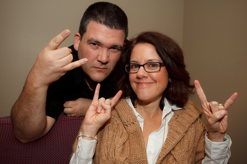
Of course, now the real question remains. Which one is your favorite?
Tags: ann handley, author photographs, business books, cc chapman, Content Rules



November 4th, 2010 at 1:55 pm
WOW! DEREK ROCKS! In the second printing of “Content Rules,” we definitely need to use one of these on the jacket!
p.s. I think it’s kind of hilarious that I NEVER get the “hook’em horns” thing right…! I’m such a loser… LOL.
November 4th, 2010 at 2:01 pm
I’m going with the first one. 🙂 Looking forward to checking out the book. 🙂
November 4th, 2010 at 2:01 pm
The third one’s best for general use, next best is the second one. C.C., you wore a black shirt that day! And Ann, the contrast between the two “hook’em horns” styles is endearing! Your co-author is one badass mother-father.
November 4th, 2010 at 2:06 pm
You get them right in your own special way. *hugs*
November 4th, 2010 at 2:07 pm
Well we didn’t coordinate our fashion. We were both at an event and Derek was too so we seized the moment.
November 4th, 2010 at 2:54 pm
Big fan of the third one.
November 4th, 2010 at 3:11 pm
I vote #3, too, with #2 as “next best”. It’s fun to see all this behind-the-scenes prep!
November 4th, 2010 at 4:32 pm
Thanks!
November 4th, 2010 at 4:32 pm
Thanks for your input and glad you are liking how we are sharing the experience with everyone. After all if we don’t practice what we preach who is going to believe what we put in the book? *grin*
November 4th, 2010 at 5:45 pm
I am a big fan of the 4th one–but maybe not for the jacket 🙂
November 4th, 2010 at 6:07 pm
Yeah that is a bit of an inside joke as we are hoping people will take photos of themselves with the book, throwing up the horns and saying Content RULES!!!
November 4th, 2010 at 8:47 pm
I like #3 too. We did a book photo contest too. Some interesting photos came in 🙂
November 4th, 2010 at 8:55 pm
If you want to see some of the photos, drop me a line. 😉
November 5th, 2010 at 4:19 pm
Love them all. If I had to pick 1, it would be #3, followed by #4.
#1: Dying to know what’s on C.C.’s mind. Also, Ann holding her conference neck gear in her hand. Love it.
#2: Solid. Great smiles, great posture, etc.
#3: Ann’s face. I mean…gotta love that expression, right?
#4: Bad ass, C.C.
DJ Waldow
Director of Community, Blue Sky Factory
http://www.blueskyfactory.com
@djwaldow
November 5th, 2010 at 5:10 pm
Great pictures! I’ll have to vote for #1 first and then #3. Although I don’t know either of you, the first picture seems to capture the mischief in your eyes and fun smile in Ann’s.
Sylvia Lima =)
November 5th, 2010 at 5:16 pm
Us mischief? *wicked grin*
November 5th, 2010 at 8:18 pm
1st one for sure. I used to be a photo editor at Conde Nast so I should get 3 votes!!!! The third one is good too.
November 5th, 2010 at 8:21 pm
There was nothing on his mind.
He wasn’t wearing pants, though.
November 5th, 2010 at 8:23 pm
I really do love #1, too. Our editor thought C.C.’s head looked a little disembodied, though… no?
November 5th, 2010 at 8:45 pm
I like #3 best. Friendly and inviting, yet professional.
#1 is fun too, but the conference ribbon is distracting from your smiling faces.
November 5th, 2010 at 8:48 pm
Ann. You crack me up…
November 5th, 2010 at 9:04 pm
Hey, I thought that was going to remain our secret!
November 6th, 2010 at 11:54 am
Put me down for #3. Not your usual author photo, yet not over the top either.
Great shoot!
November 10th, 2010 at 3:56 pm
#3
The rest seem to not quite “fit” somehow to me. I love your expressions in all four though!
November 27th, 2010 at 12:37 am
I like Photo #3 the best. #2 is awfully goo too. Looking forward to your book coming out.